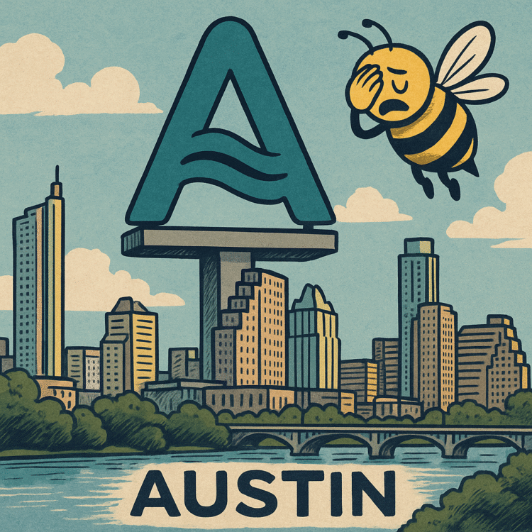
On September 4–5, 2025, Austin unveiled its first-ever unified city logo: a wavy blue-green “A” allegedly inspired by the hills, rivers, bridges, and violet-crown skies that define the Texas capital. It is, in the words of the city, a “strategic modernization.” In the words of the internet, it’s “Dallas-adjacent,” “corporate clipart,” and “the most expensive kindergarten doodle in municipal history.”
The cost? $1.1 to $1.17 million. The promise? That this single glyph will unify 300+ departmental logos into one instantly recognizable mark. No more visual chaos between Parks & Rec, Public Works, and the Office of Downtown Vibes (or whatever new committee City Hall invents next). Instead, every city truck, website, uniform, and trash can will eventually sport the same soothing “A.”
Austin officials insist this is about cohesion, clarity, and cost savings. But in practice, it’s about what public branding always becomes: a battlefield where aesthetics collide with politics, and a color palette becomes a proxy war for identity, priorities, and pocketbooks.
The Origins of the Glyph
The city traces this back to 2018, when consultants and brand whisperers pitched a unified identity system. The problem, they argued, was fragmentation. Residents couldn’t tell a city agency from a knockoff HOA newsletter. Departments each had bespoke marks that screamed “committee by committee chaos.”
So Pentagram and TKO were hired, contracts signed, workshops held, mood boards assembled. Five years later, out came the “A”—wavy, calming, modern, corporate enough to look good on a LinkedIn banner, abstract enough to mean anything.
In design terms, it’s fine. In political terms, it’s napalm.
The Price Tag
The number that matters isn’t the Pantone code. It’s $1.1–$1.17 million. That’s the cost of developing, testing, and beginning implementation. And that’s before the slow rollout: digital first (Oct. 1), then trucks, signage, uniforms, stationery, and—inevitably—every surface large enough to take vinyl wrap.
Critics immediately seized on the timing. Austin is facing budget strain and a pending tax hike. Streets still flood, schools are still stretched, housing is still a nightmare. Against that backdrop, $1 million for an “A” felt less like modernization and more like a municipal midlife crisis.
Fiscal hawks called it vanity spending. Conservatives called it liberal decadence. Designers called it lazy. Residents called it… well, mostly just ugly.
The Dallas Problem
The harshest insult? That it looks like Dallas.
For Austinites, “Dallas-adjacent” is less about aesthetics than about identity. Dallas is corporate. Dallas is conservative. Dallas is shiny surfaces without the scrappy authenticity Austin sells to itself. To accuse Austin of looking like Dallas is to accuse it of selling out.
And that’s what the backlash has really been about. Not the strokes of the “A,” but what they symbolize: a city straddling the line between its weird, creative myth and its real, corporate reality.
The City’s Defense
City officials insist the cost is an investment. They argue that unifying hundreds of department-specific marks into one system will save money in the long term. No more endless cycles of ad-hoc logos, mismatched designs, or duplicated spending.
They call it “brand cohesion.” They call it “clearer communication.” They call it “finally giving Austin one face.”
But that assumes residents want one face. Austin has built its entire reputation on multiplicity—Keep Austin Weird wasn’t a design campaign, it was a declaration of independence from cohesion. Trying to give Austin “one face” is like trying to give a music festival “one genre.”
Designers at War
The design community has split. Some defend the minimalism, pointing out that all strong civic logos are hated at launch. Remember London 2012’s Olympic logo? Remember Airbnb’s “Bélo”? Everyone mocked them until they just… existed. Time sands down outrage.
Others argue the Austin “A” isn’t bold enough to deserve hate. It’s too bland, too corporate, too cautious. It looks like it could belong to a startup, a bank, a chain of urgent care clinics. In trying to be everything, it risks being nothing.
Which may be the most accurate reflection of modern Austin possible.
Branding as Proxy War
What fascinates isn’t the logo itself. It’s the way branding becomes a proxy war. A mark is never just a mark. It’s a canvas onto which everyone projects grievances.
For fiscal conservatives, the “A” is evidence of liberal waste. For artists, it’s proof of municipal mediocrity. For progressives, it’s a distraction from real inequities. For boosters, it’s a necessary modernization. For trolls, it’s meme fodder.
A single shape becomes the vessel for every frustration residents already feel about housing, traffic, affordability, culture. The logo doesn’t create anger. It absorbs it.
Corporate Vibes, Civic Realities
There’s something profoundly revealing in the fact that Austin’s new identity could double as a fintech logo. It’s clean, wavy, approachable. It also feels detached, unrooted, placeless. Which is, arguably, what Austin has become: a city caught between its mythology and its market.
The violet-crown skies, the rivers, the hills—they’re still there. But they’re increasingly backdrop to tech campuses, glass condos, and venture capital brunches. The new “A” doesn’t evoke weirdness or grit. It evokes branding committees, precisely because that’s who birthed it.
When Logos Become Memes
The backlash has, predictably, gone meme-shaped. Side-by-side comparisons show the “A” next to clipart waves. TikTok designers redraw it in 15 minutes as a joke. Residents slap googly eyes on it, turn it into “Dallas’ hat,” and make it say “Actually, I’m corporate now.”
This is the other truth about branding in the 2020s: your new logo is not just a design. It’s meme fuel. And the memes will define it more than the rollout ever could.
The City as Brand
What the uproar really shows is how fully cities have become brands. Austin is not just a capital. It’s a product. It markets itself as “weird,” as “creative,” as “live music capital,” as “tech boomtown.” The logo is not for residents. It’s for tourists, investors, newcomers. It’s a pitch deck dressed as a design system.
And that’s why people resent it. Because for all the talk of cohesion and clarity, the rebrand feels less like it belongs to the people of Austin and more like it belongs to the forces remaking Austin into a commodity.
The Satirical Core
The satire is brutal and obvious:
- A city spends $1.1 million to make itself look less weird.
- A logo meant to unify departments instead unifies residents in mockery.
- A design meant to represent rivers, hills, and skies instead represents Dallas.
- A promise of clarity delivers ambiguity.
- A city obsessed with brand identity forgets that identity is built by people, not marks.
It’s the oldest civic irony: the harder you try to brand authenticity, the faster it slips away.
The Haunting Observation
On September 4–5, Austin didn’t just unveil a logo. It unveiled a mirror. The “A” is less a design than a diagnosis: a city caught between weird and corporate, authenticity and branding, pride and pocketbook.
Residents mocked the shape. Designers critiqued the strokes. Politicians sniped at the cost. But the truth is that the “A” succeeded in one sense: it captured Austin exactly as it is now. Expensive, corporate, trying to hold onto identity while selling itself to the highest bidder.
The haunting truth is this: a logo can’t save a city. It can only reveal it. And Austin’s “A” reveals a capital that no longer knows if it’s weird or just branded as weird, no longer sure if cohesion is pride or compromise, no longer able to tell the difference between who it is and how it markets itself.
The logo will fade into normalcy, as all logos do. One day it will be on trash trucks and library cards and no one will blink. But the questions it surfaced—about who owns Austin’s identity, who pays for it, and who gets erased in the process—will linger long after the memes fade.
And for a city that once promised to stay weird, nothing is weirder than paying a million dollars to look like everywhere else.